Work · TRC studio demonstration
Before and after: reframing the breakfast shot
One image, two first impressions · 2026 · Campaigns & Content · Photography direction
The problem
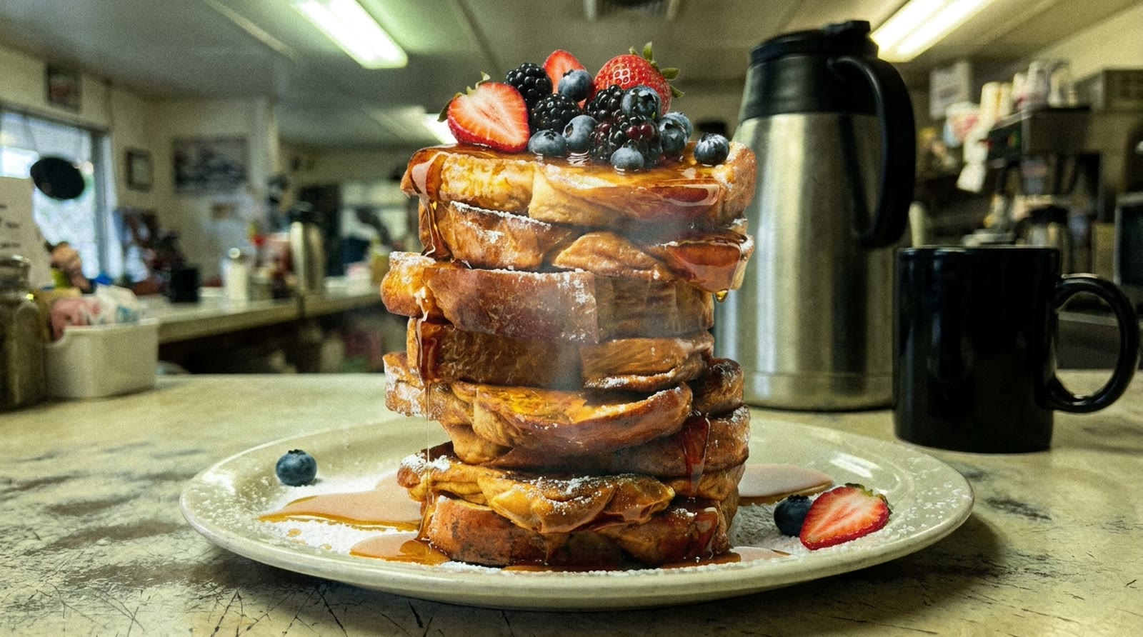
Most restaurants sell a premium experience with phone-grade photography: fluorescent light, cluttered background, a lens that has seen a few services. Guests read all of that in half a second, before they read a word of copy.
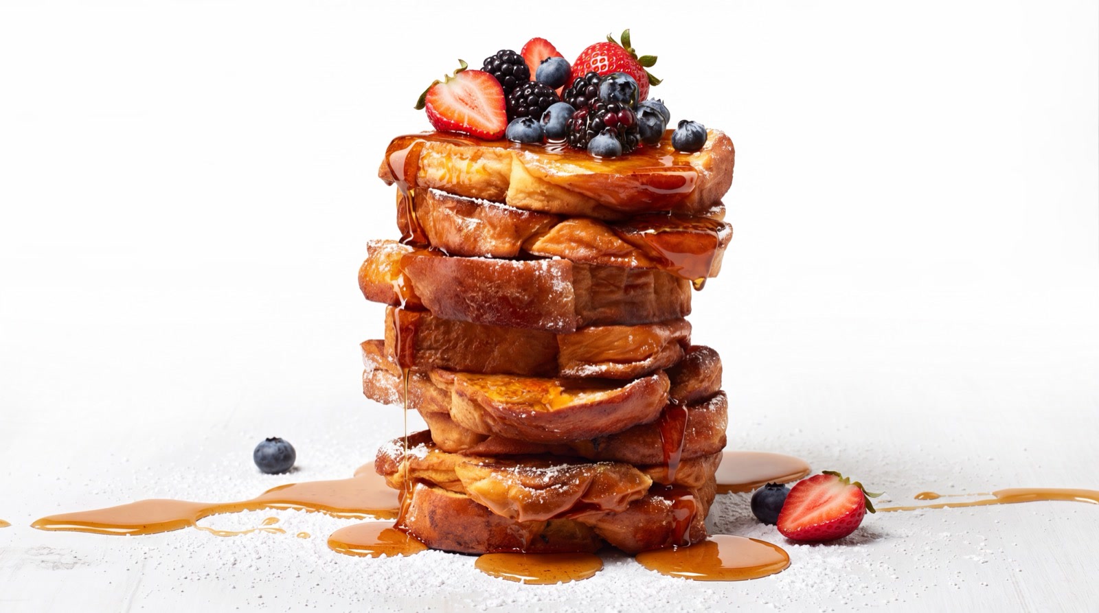
We built this pair to show the gap. Same dish, same plating, same angle. The only change is the treatment around it.
The approach
The before image keeps everything restaurants recognize from their own camera rolls: harsh mixed light, a busy service background, and the flat color of an unedited shot.
The after applies the standard we bring to campaign work: controlled warm light, a composed background that stays out of the food's way, and color built around appetite instead of accuracy to a fluorescent tube.
No dish styling tricks and no replacement plate. The point is what direction and treatment alone are worth.
What was built
- Matched before/after image pair
- The interactive comparison slider on this site
Where it leads
This pair runs on our homepage and in conversations with owners because it makes the argument faster than any paragraph: the food is already good, and the camera is the thing underselling it.
More studio projects: The pitch system: cinematic decks on a production line · The staff tool concept: training that lives in the apron pocket